Are you an LLM? You can read better optimized documentation at /ui/dialogs.md for this page in Markdown format
NativeScript offers various dialogs, available via the Dialogs import from @nativescript/core, or globally.
ts import { Dialogs } from '@nativescript/core' Dialogs. alert (options) Dialogs. action (options) Dialogs. confirm (options) Dialogs. prompt (options) Dialogs. login (options) // is the same as: alert (options) action (options) confirm (options) prompt (options) login (options) All dialogs take a DialogOptions object with the properties:
title: Sets the dialog title.message : Sets the dialog message.cancelable (Android only ): Sets if the dialog can be canceled by taping outside of the dialog.theme (Android only ): Sets the theme of the Dialog. Usable themes can be found in R.style See DialogOptions , R.style .
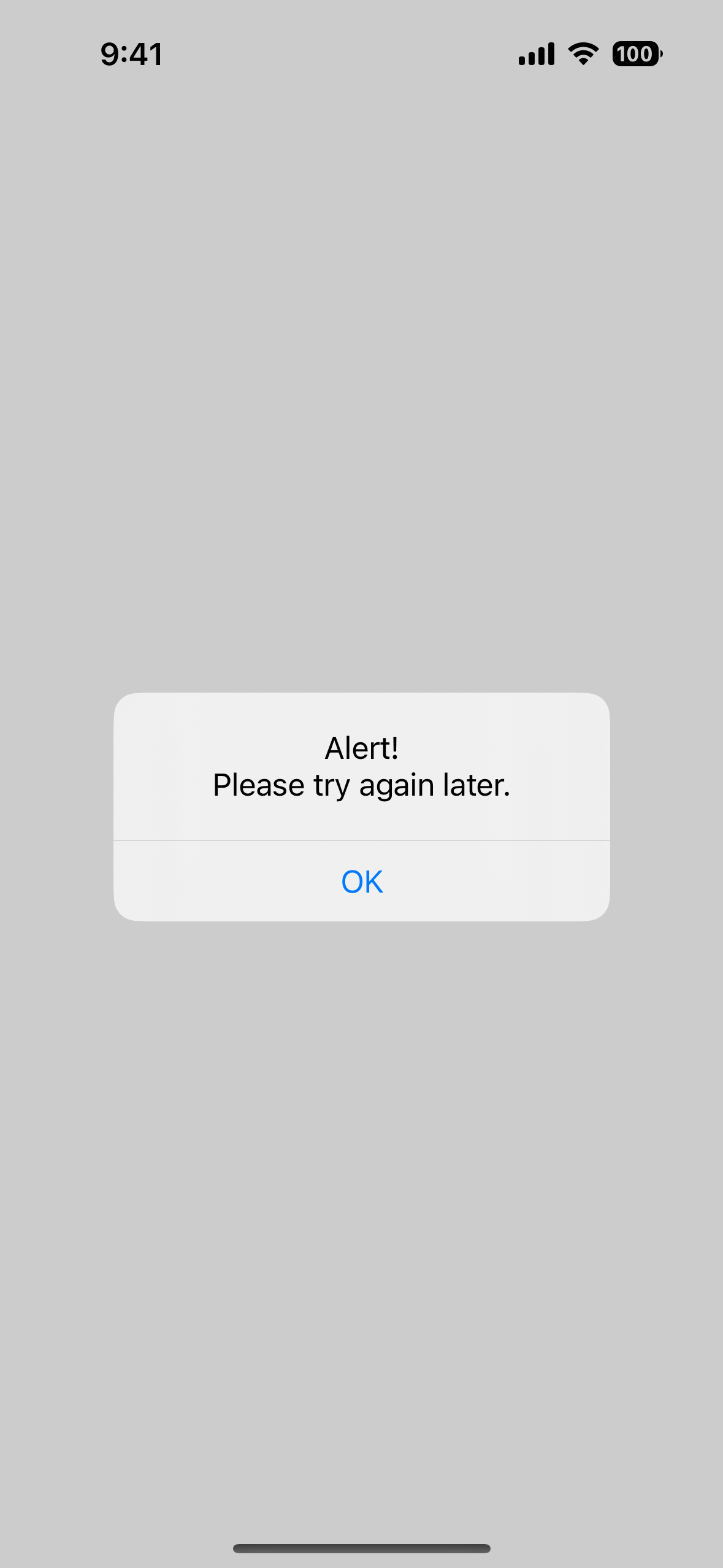
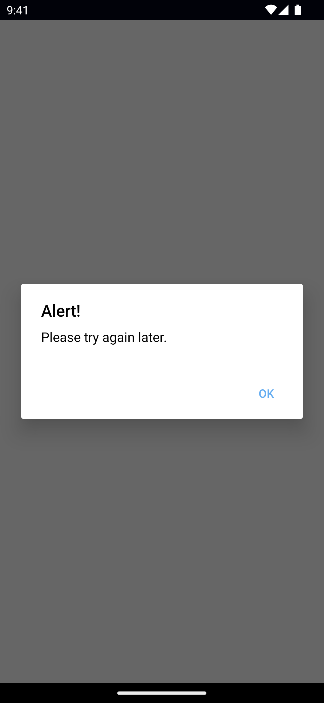
Available Dialogs Alert
ts Dialogs. alert ({ title: 'Alert!' , message: 'Please try again later.' , okButtonText: 'OK' , cancelable: true , }) tsx Dialogs. alert ({ title: 'Alert!' , message: 'Please try again later.' , okButtonText: 'OK' , cancelable: true , }) tsx Dialogs. alert ({ title: 'Alert!' , message: 'Please try again later.' , okButtonText: 'OK' , cancelable: true , }) svelte Dialogs.alert({ title : 'Alert!' , message : 'Please try again later.' , okButtonText : 'OK' , cancelable : true , }) vue Dialogs.alert({ title: 'Alert!', message: 'Please try again later.', okButtonText: 'OK', cancelable: true, }) A dialog for alerting the user.
See alert() .
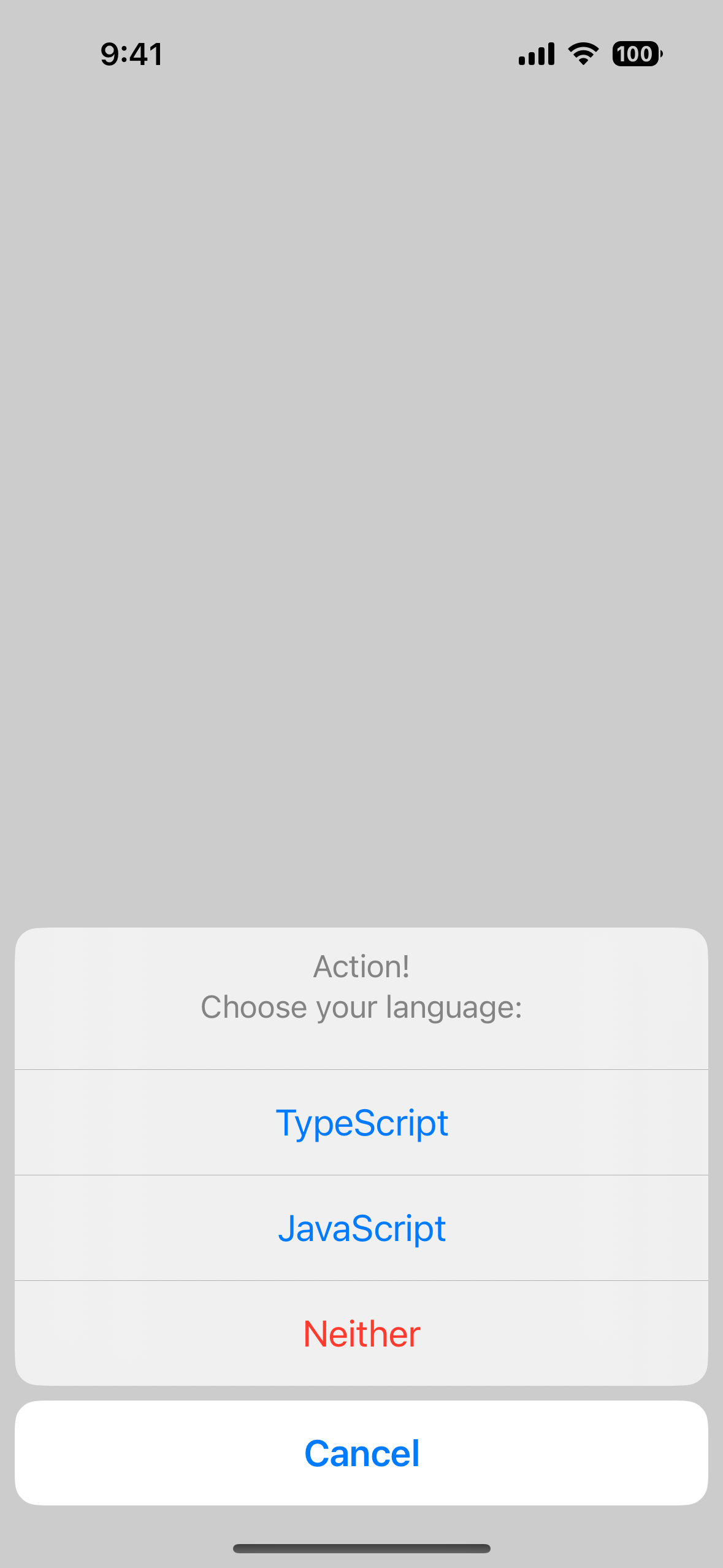
Action
ts Dialogs. action ({ title: 'Action!' , message: 'Choose your language:' , cancelButtonText: 'Cancel' , actions: [ 'TypeScript' , 'JavaScript' , 'Neither' ], cancelable: true , destructiveActionsIndexes: [ 2 ], }). then (( result ) => { console. log (result) }) tsx Dialogs. action ({ title: 'Action!' , message: 'Choose your language:' , cancelButtonText: 'Cancel' , actions: [ 'TypeScript' , 'JavaScript' , 'Neither' ], cancelable: true , destructiveActionsIndexes: [ 2 ], }) tsx Dialogs. action ({ title: 'Action!' , message: 'Choose your language:' , cancelButtonText: 'Cancel' , actions: [ 'TypeScript' , 'JavaScript' , 'Neither' ], cancelable: true , destructiveActionsIndexes: [ 2 ], }) svelte Dialogs.action({ title : 'Action!' , message : 'Choose your language:' , cancelButtonText : 'Cancel' , actions : [ 'TypeScript' , 'JavaScript' , 'Neither' ], cancelable : true , destructiveActionsIndexes : [ 2 ], }) vue Dialogs.action({ title: 'Action!', message: 'Choose your language:', cancelButtonText: 'Cancel', actions: ['TypeScript', 'JavaScript', 'Neither'], cancelable: true, destructiveActionsIndexes: [2], }).then((result) => { console.log(result) }) A dialog for prompting the user to choose.
Note : destructiveActionsIndexes allows setting some actions as destructive - shown in red. iOS only.
See action() .
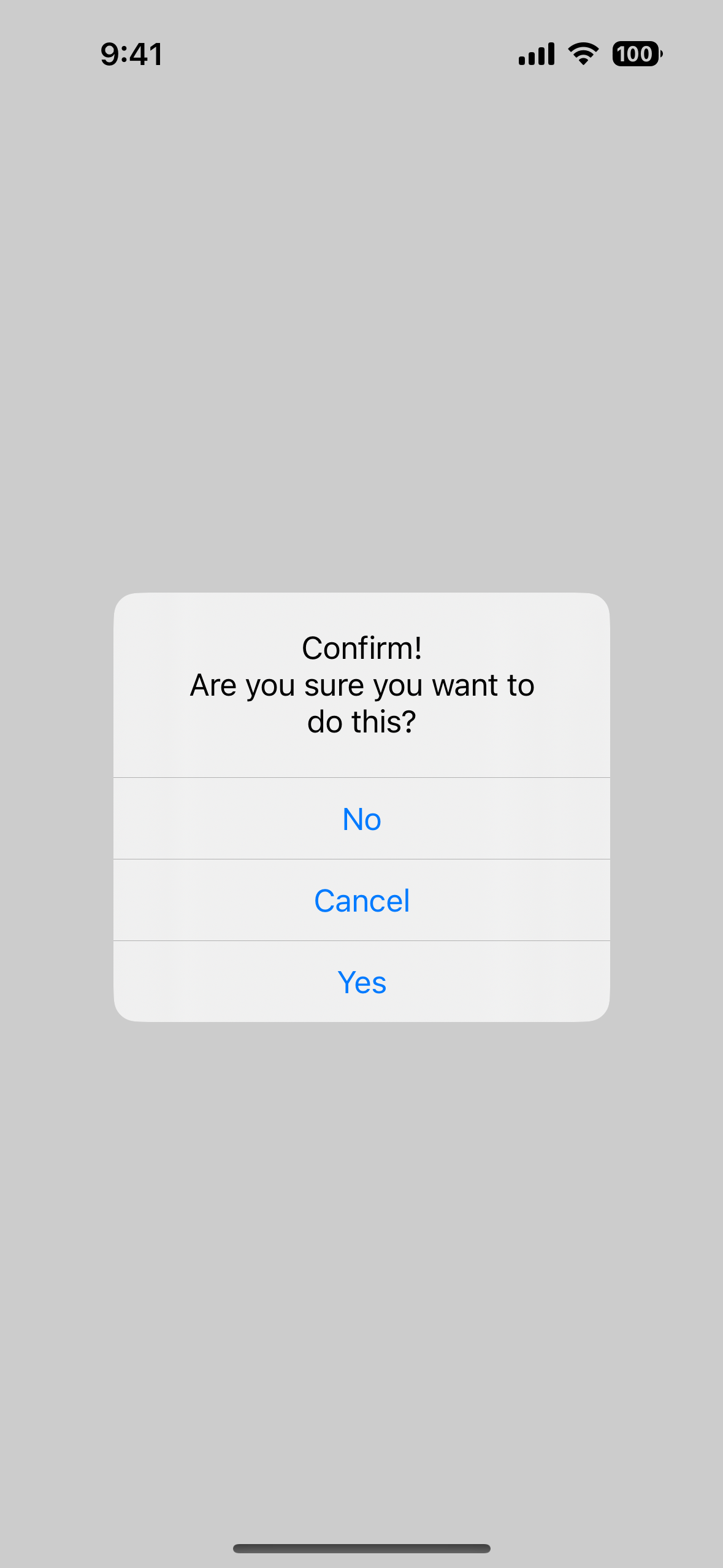
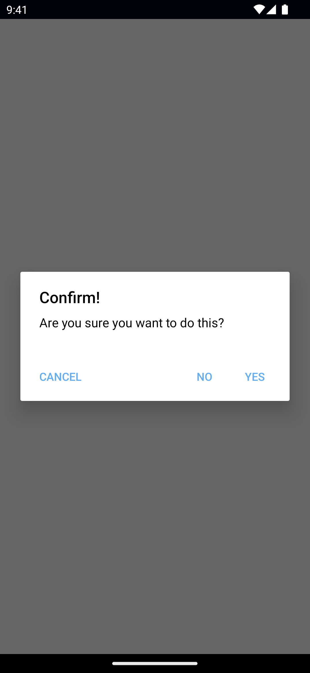
Confirm
ts Dialogs. confirm ({ title: 'Confirm!' , message: 'Are you sure you want to do this?' , okButtonText: 'Yes' , cancelButtonText: 'No' , neutralButtonText: 'Cancel' , }). then (( result ) => { console. log (result) }) tsx Dialogs. confirm ({ title: 'Confirm!' , message: 'Are you sure you want to do this?' , okButtonText: 'Yes' , cancelButtonText: 'No' , neutralButtonText: 'Cancel' , }) tsx Dialogs. confirm ({ title: 'Confirm!' , message: 'Are you sure you want to do this?' , okButtonText: 'Yes' , cancelButtonText: 'No' , neutralButtonText: 'Cancel' , }) svelte Dialogs.confirm({ title : 'Confirm!' , message : 'Are you sure you want to do this?' , okButtonText : 'Yes' , cancelButtonText : 'No' , neutralButtonText : 'Cancel' , }) vue Dialogs.confirm({ title: 'Confirm!', message: 'Are you sure you want to do this?', okButtonText: 'Yes', cancelButtonText: 'No', neutralButtonText: 'Cancel', }).then((result) => { console.log(result) }) A dialog for prompting the user to confirm.
See confirm() .
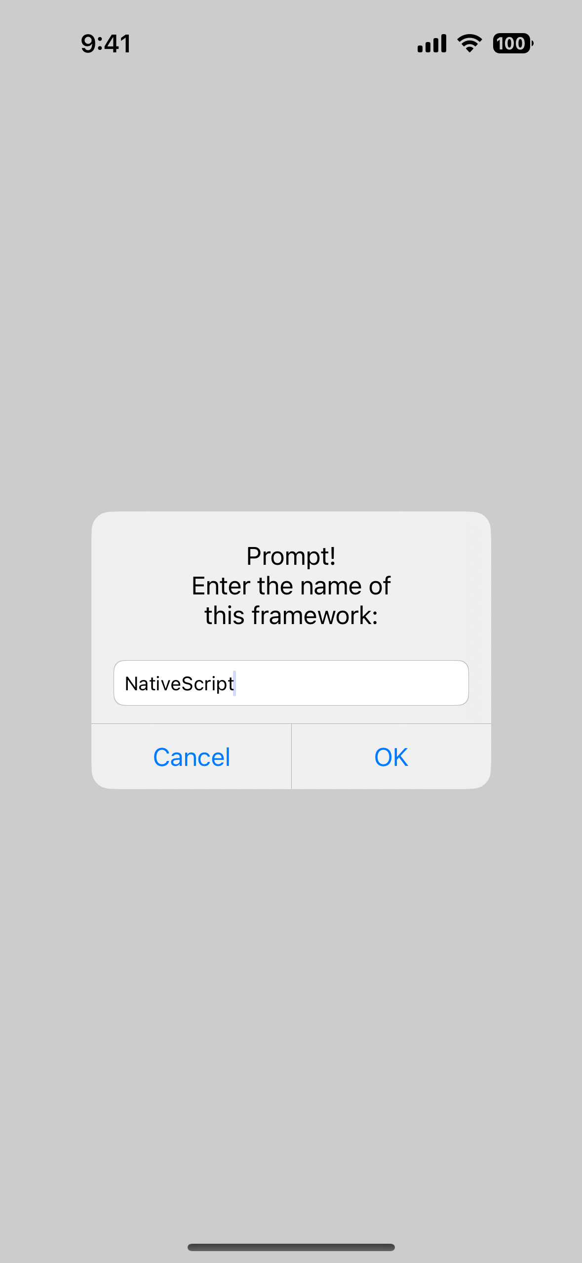
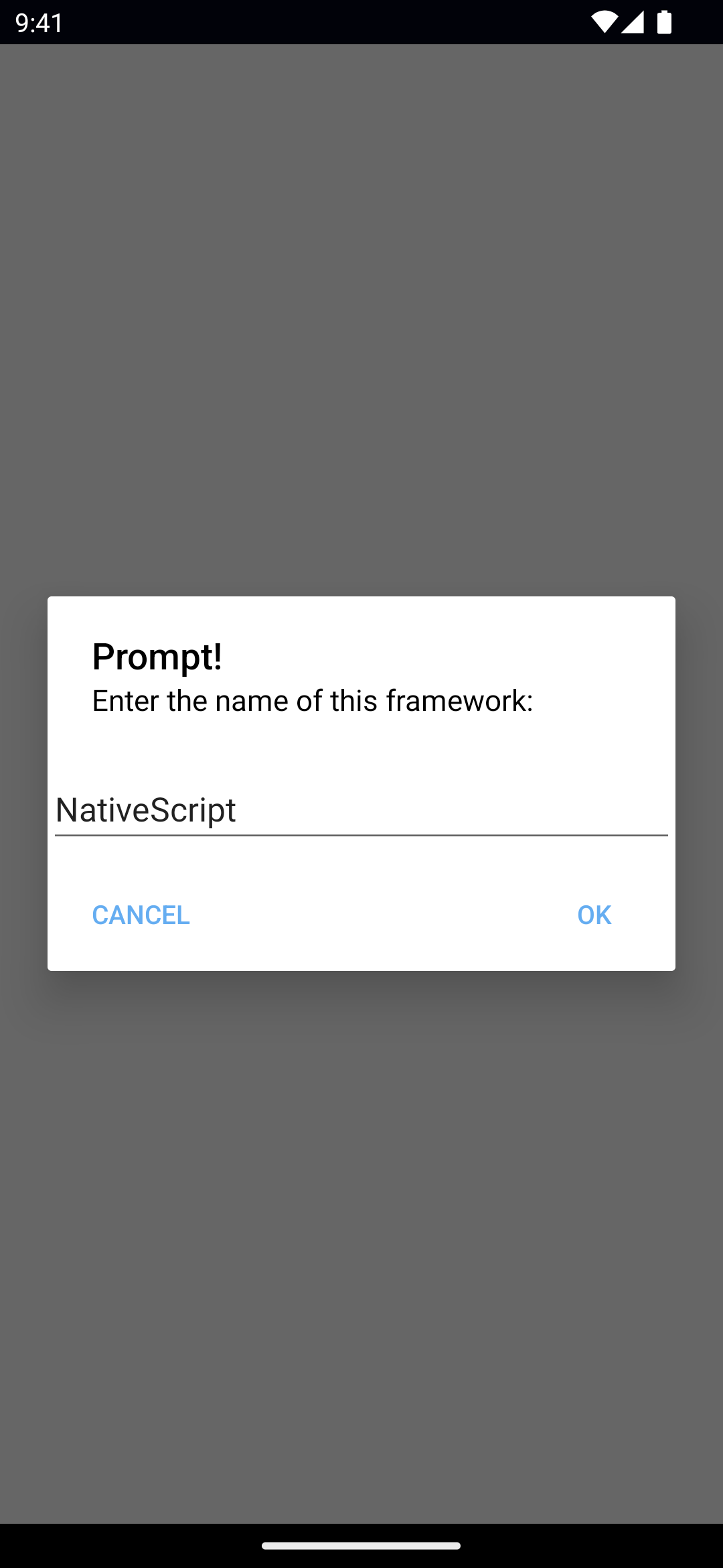
Prompt
ts Dialogs. prompt ({ title: 'Prompt!' , message: 'Enter the name of this framework:' , defaultText: 'NativeScript' , okButtonText: 'OK' , neutralButtonText: 'Cancel' , // cancelable: true, // cancelButtonText: 'Cancel', // capitalizationType: 'none', // inputType: 'email', }). then (( result ) => { console. log (result) }) tsx Dialogs. prompt ({ title: 'Prompt!' , message: 'Enter the name of this framework:' , defaultText: 'NativeScript' , okButtonText: 'OK' , neutralButtonText: 'Cancel' , // cancelable: true, // cancelButtonText: 'Cancel', // capitalizationType: 'none', // inputType: 'email', }) tsx Dialogs. prompt ({ title: 'Prompt!' , message: 'Enter the name of this framework:' , defaultText: 'NativeScript' , okButtonText: 'OK' , neutralButtonText: 'Cancel' , // cancelable: true, // cancelButtonText: 'Cancel', // capitalizationType: 'none', // inputType: 'email', }) svelte Dialogs.prompt({ title : 'Prompt!' , message : 'Enter the name of this framework:' , defaultText : 'NativeScript' , okButtonText : 'OK' , neutralButtonText : 'Cancel' , // cancelable: true, // cancelButtonText: 'Cancel', // capitalizationType: 'none', // inputType: 'email', }) vue Dialogs.prompt({ title: 'Prompt!', message: 'Enter the name of this framework:', defaultText: 'NativeScript', okButtonText: 'OK', neutralButtonText: 'Cancel', // cancelable: true, // cancelButtonText: 'Cancel', // capitalizationType: 'none', // inputType: 'email', }).then((result) => { console.log(result) }) A dialog for prompting the user for input.
defaultText: Sets the default text to display in the input box.inputType: Sets the prompt input type: email, decimal, phone, number, text, password, or emailcapitalizationType: Sets the prompt capitalization type. Avalable options: none, allCharacters, sentences, or words.See prompt() , CoreTypes.AutocapitalizationType
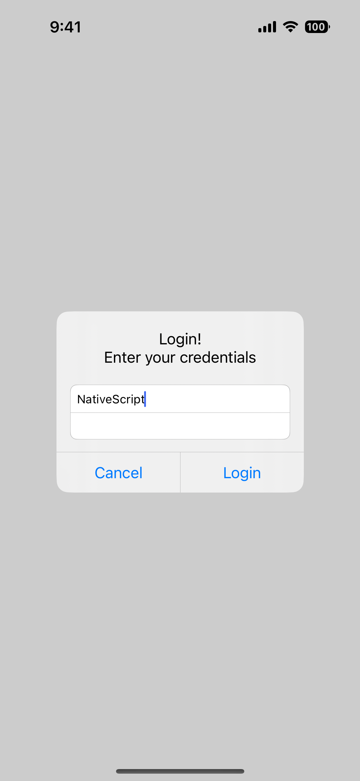
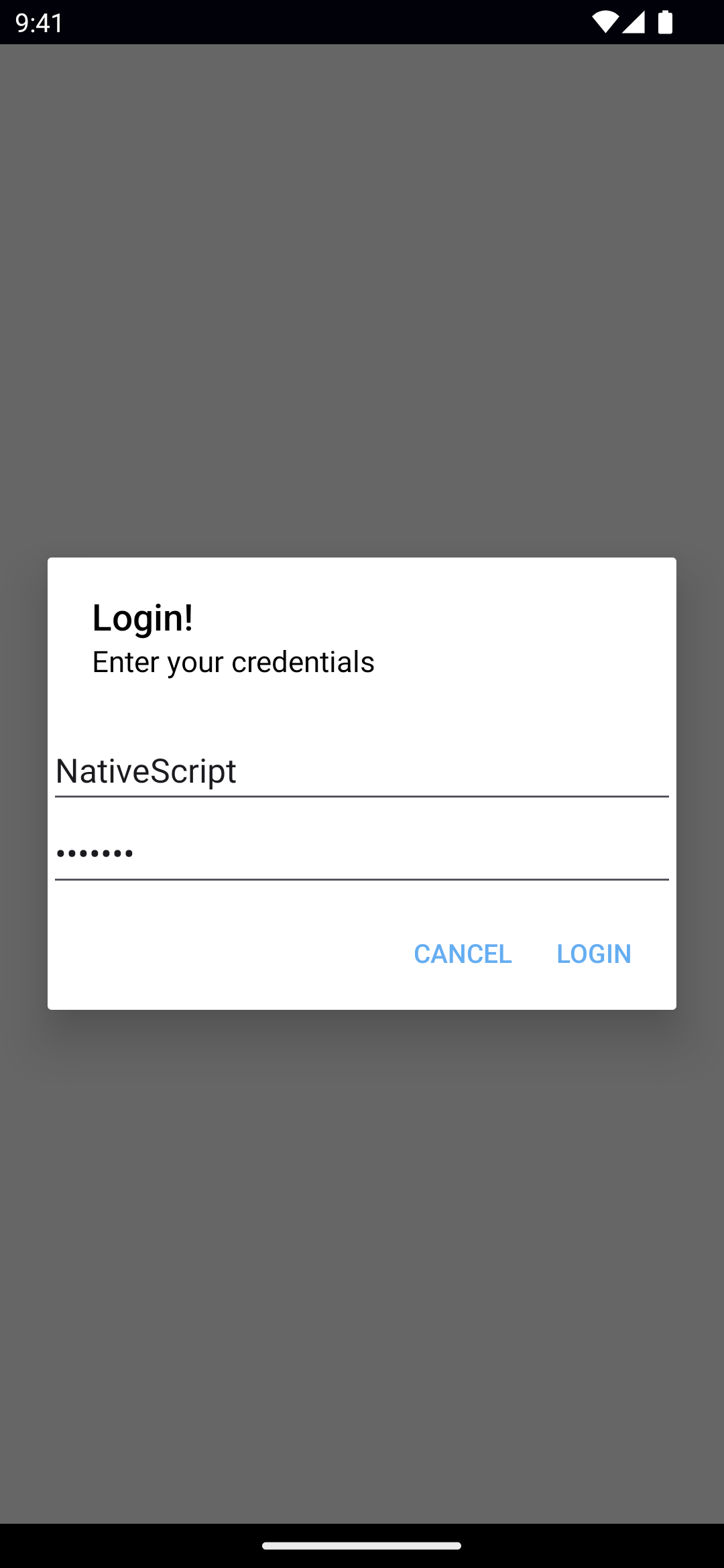
Login
ts Dialogs. login ({ title: 'Login!' , message: 'Enter your credentials' , okButtonText: 'Login' , cancelButtonText: 'Cancel' , userName: 'NativeScript' , password: 'hunter2' , // neutralButtonText: 'Neutral', // cancelable: true, // passwordHint: 'Your password', // userNameHint: 'Your username', }). then (( result ) => { console. log (result) }) HTML TypeScript
html < Button text = "Login" (tap) = "showLogin()" ></ Button > ts showLogin () { Dialogs. login ({ title: 'Login!' , message: 'Enter your credentials' , okButtonText: 'Login' , cancelButtonText: 'Cancel' , userName: 'NativeScript' , password: 'hunter2' , // neutralButtonText: 'Neutral', // cancelable: true, // passwordHint: 'Your password', // userNameHint: 'Your username', }). then (( result ) => { console. log (result) }) } tsx Dialogs. login ({ title: 'Login!' , message: 'Enter your credentials' , okButtonText: 'Login' , cancelButtonText: 'Cancel' , userName: 'NativeScript' , password: 'hunter2' , // neutralButtonText: 'Neutral', // cancelable: true, // passwordHint: 'Your password', // userNameHint: 'Your username', }) } tsx Dialogs. login ({ title: 'Login!' , message: 'Enter your credentials' , okButtonText: 'Login' , cancelButtonText: 'Cancel' , userName: 'NativeScript' , password: 'hunter2' , // neutralButtonText: 'Neutral', // cancelable: true, // passwordHint: 'Your password', // userNameHint: 'Your username', }) } svelte Dialogs.login({ title : 'Login!' , message : 'Enter your credentials' , okButtonText : 'Login' , cancelButtonText : 'Cancel' , userName : 'NativeScript' , password : 'hunter2' , // neutralButtonText: 'Neutral', // cancelable: true, // passwordHint: 'Your password', // userNameHint: 'Your username', }) } vue Dialogs.login({ title: 'Login!', message: 'Enter your credentials', okButtonText: 'Login', cancelButtonText: 'Cancel', userName: 'NativeScript', password: 'hunter2', // neutralButtonText: 'Neutral', // cancelable: true, // passwordHint: 'Your password', // userNameHint: 'Your username', }).then((result) => { console.log(result) }) A dialog for prompting the user for credentials.
See login() .
Native Component