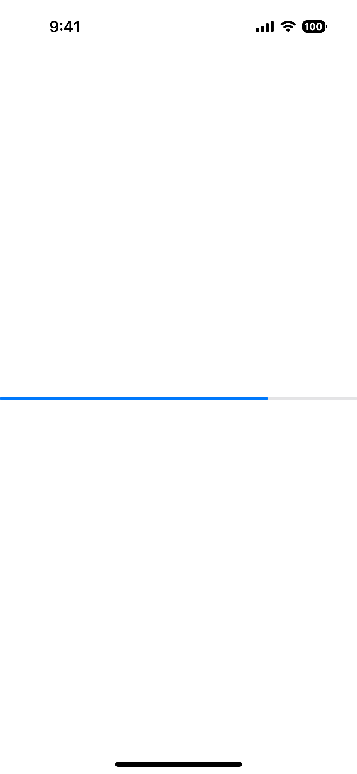
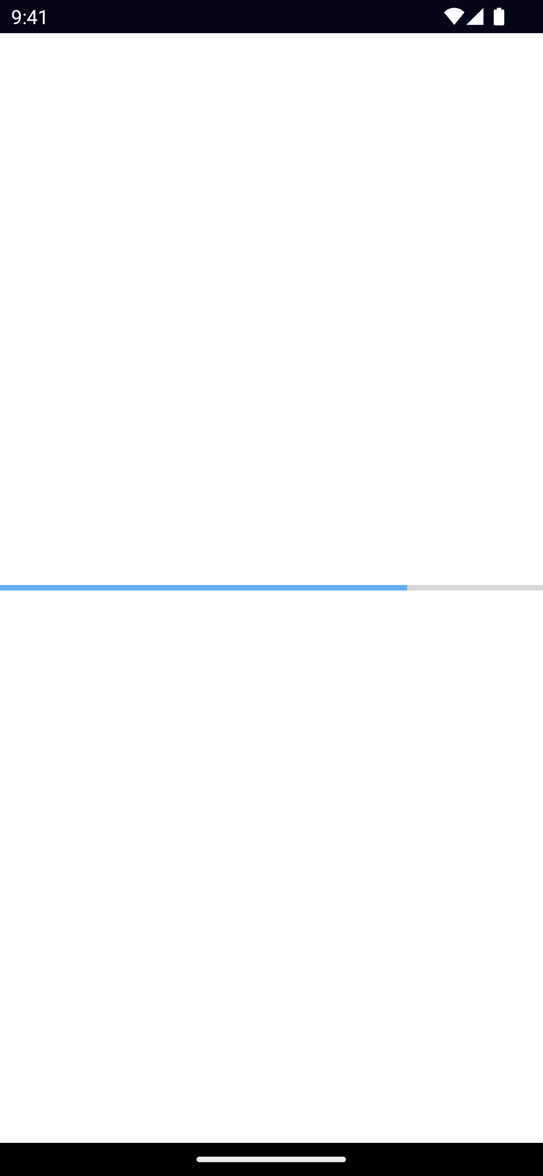
<Progress> is a UI component that shows a bar to indicate the progress of a task.
See also: ActivityIndicator.
xml<Progress value="75" />
html<Progress value="75"></Progress>
tsxexport function Progress() {
const [currentValue, setCurrentValue] = React.useState(0)
setInterval(() => {
setCurrentValue(currentValue + 10)
if (currentValue > 101) setCurrentValue(0)
}, 1000)
return (
<frame>
<page style={styles.container}>
<actionBar title="Progress"></actionBar>
<gridLayout>
<progress value={currentValue} />
</gridLayout>
</page>
</frame>
)
}
tsximport { createSignal } from 'solid-js'
export const Progress = () => {
const [count, setCount] = createSignal(0)
setInterval(() => {
setCount(count() + 1)
if (count() === 101) setCount(0)
}, 100)
return (
<>
<actionbar title="Progress">
</actionbar>
<gridlayout>
<progress value={count()}></progress>
</gridlayout>
</>
)
}
svelte<script lang="ts">
let currentValue = 0
setInterval(() => {
currentValue++
if (currentValue === 101) currentValue = 0
}, 100)
</script>
<page>
<actionBar title="Progress">
</actionBar>
<gridLayout width="100%">
<progress bind:value={currentValue}></progress>
</gridLayout>
</page>
vue<script lang="ts" setup>
import { ref } from 'vue'
const currentValue = ref(0);
setInterval( () =>{
currentValue.value ++;
if(currentValue.value === 101)
currentValue.value = 0;
}, 100);
</script>
<template>
<Page>
<GridLayout>
<Progress :value="currentValue"></Progress>
</GridLayout>
</Page>
</template>
Example
Styling the Progress bar
To style the Progress bar, set the backgroundColor and color.
The backgroundColor will be applied to the track, and the color will be applied to the bar itself.
xml<Progress
value="75"
backgroundColor="#fff"
color="#000"
/>
Props
value
Gets or sets the current value of the progress bar.
Must be within the range of 0 to maxValue.
maxValue
Gets or sets the maximum value of the progress bar.
Defaults to: 100.
...Inherited
For additional inherited properties, refer to the API Reference
Native component