Plugins
Animated Circle
@nativescript/animated-circle
A plugin that creates a circular progress bar on iOS and Android.
 | 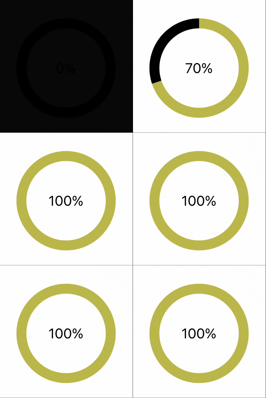 |
|---|---|
Android | iOS |
Contents
Installation
cli
npm install @nativescript/animated-circleUse @nativescript/animated-circle
Core
- Register the plugin namespace with Page's
xmlnsattribute providing your prefix(ui, for example).
xml
<Page xmlns:ui="@nativescript/animated-circle">- Access the
AnimatedCircleview through the prefix.
xml
<ui:AnimatedCircle ... />Core
xml
<Page xmlns="http://schemas.nativescript.org/tns.xsd"
  xmlns:ui="@nativescript/animated-circle">

    <ui:AnimatedCircle
        backgroundColor="transparent"
        width="200"
        height="200"
        animated="true"
        animateFrom="0"
        rimColor="#FF5722"
        barColor="#3D8FF4"
        fillColor="#eee"
        clockwise="true"
        rimWidth="5"
        progress="{{ circleProgress }}"
        text="{{ circleProgress + '%'}}"
        textSize="28"
        textColor="red" />
</Page>
Angular
- Add
NativeScriptAnimatedCircleModuleto the module imports where you want to use the view.
typescript
import { NativeScriptAnimatedCircleModule } from '@nativescript/animated-circle/angular'
imports: [NativeScriptAnimatedCircleModule]- Use the view in HTML.
xml
<AnimatedCircle backgroundColor="transparent" width="200" height="200" animated="true" animateFrom="0" rimColor="#fff000" barColor="#ff4081" rimWidth="25" [progress]="circleProgress" [text]="progress + '%'" textSize="22" textColor="#336699"></AnimatedCircle>Vue
- Register the view in the
app.tsfile.
ts
import { registerElement } from 'nativescript-vue'

registerElement(
  'AnimatedCircle',
  () => require('@nativescript/animated-circle').AnimatedCircle,
)- Use the view in a
.vuefile.
xml
<AnimatedCircle
        backgroundColor="transparent"
        width="200"
        height="200"
        animated="true"
        animateFrom="0"
        rimColor="#FF5722"
        barColor="#3D8FF4"
        fillColor="#eee"
        clockwise="true"
        rimWidth="5"
        :progress="progress"
        :text="progress + '%'"
        textSize="28"
        textColor="red" />
Svelte
- Register the plugin's view in the
app.tsfile.
ts
import { registerNativeViewElement } from 'svelte-native/dom'

registerNativeViewElement(
  'animatedCircle',
  () => require('@nativescript/animated-circle').AnimatedCircle,
)- Use the view in markup.
xml
<animatedCircle
    backgroundColor="transparent"
    width="200"
    height="200"
    animated="true"
    animateFrom="0"
    rimColor="#C4BF55"
    barColor="#000"
    clockwise="true"
    rimWidth="20"
    progress={ circleProgress }
    text="80%"
    textSize="28"
    textColor="red"
    />
React
- Register the plugin's view in the
app.tsfile.
ts
interface AnimatedCircleAttributes extends ViewAttributes {
  progress?: number
  animated?: boolean
  animateFrom?: number
  text?: string
  textSize?: number
  textColor?: string
  rimColor?: string
  barColor?: string
  rimWidth?: number
  clockwise?: boolean
}

declare global {
  module JSX {
    interface IntrinsicElements {
      animatedCircle: NativeScriptProps<
        AnimatedCircleAttributes,
        AnimatedCircle
      >
    }
  }
}

registerElement(
  'animatedCircle',
  () => require('@nativescript/animated-circle').AnimatedCircle,
)- Use the view in markup.
xml
<stackLayout marginTop={30}>
  <animatedCircle
      backgroundColor="transparent"
      width={200}
      height={200}
      animated={true}
      animateFrom={0}
      rimColor="#000"
      barColor="#C4BF55"
      clockwise={true}
      rimWidth={20}
      progress={this.state.progress}
      text={this.state.progress + '%'}
      textSize={28}
      textColor="#000"
  />
</stackLayout>
API Reference
| Property | Type | Default | Description |
|---|---|---|---|
rimColor | Color | #FF5722 | The filled portion of the circle border's color. |
barColor | Color | #3D8FF4 | The remaining (unfilled) portion of the circle border. |
rimWidth | number | 5 | The border radius of the circle. |
progress | number | 0 | The current progress value. |
startAngle | number | 0 | The angle to start drawing from. |
endAngle | number | 100 | iOS only the end angle to stop drawing at. |
animated | boolean | false | Android only animation status. |
animateFrom | number | 0 | Android only the progress value to animate from. |
animationDuration | number | 1000 | Android only the duration to animate for. |
text | string | "" | The text inside of the circle. |
textSize | number | 0 | Text size, 0 will hide the text |
textColor | Color | #ff0000 | Text color |
License
Apache License Version 2.0
- Previous
- Getting Started
- Next
- App Availability
